In the market if you make a trade at the wrong price, you can incur heavy loss even though the stock has performed well. Technical analysis is all about buying the stock at the right price at the right time. Analysts use different methods to forecast future price movements of stocks by analysing past trading activity. It doesn’t matter whether you are a short term trader or a long term, price forecasting is the most important step you should first make in your decision making process.
All fundamental information, political events, natural disasters and psychological factors are discounted in price movement.
One of the biggest toll technical analysts uses is chart. Chart is basically depicts the price movements overtime. Chart shows the current situation and the analysis lays out the probabilities for various possible outcomes. This means, it’s a valuable tool to determine the probabilities of success to decide buying or selling or to hold a stock.
In all these charts, you will find two things common; the X-axis (vertical axis) and Y-axis (horizontal axis). The X-axis shows the price scale, while the Y-axis records time. Volume is recorded along the bottom of the page.
Line Charts
The most common type of charts is Line chart. Through this you tracks the closing prices of the stock over a specific period. To draw this type of chart, you need to identify each closing price and then connect these by lines to get a graphical representation. The biggest drawback of this is it does not give you much information on the intraday movement of stock prices.
In line chart, you take the period in the X-axis and the price in the Y-axis. Trading volume details are shown as a subset of the price charts so that the price movement at any point of time can be directly correlated with the volume chart. Trading volume refers to the number of stocks of a company that were bought and sold in the market on a particular trading day.
To track intraday movement of prices over a specific period we have two different types of chart used widely around the world, bar and candlestick charts. Bar chart is widely used in the western world and candlestick charting is used in East Asian countries.
Bar Chart
Within the horizontal and vertical axis, single vertical lines are drawn to represent the range, high and low price of the stock reached during a given period of time.
In bar chart, the top end of each vertical line signifies the highest price of the stock while the bottom point signifies the lowest price at which its traded at during the day. The high and low price of a stock is connected by a straight line to form body of the bar, also known as range. The open price is shown as a small tic to the left side of the bar and close price is shown as a small tic to the right side of the bar.
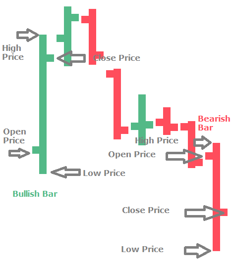
Open, high, low and close data is analysed by analysts to summarize what happened during the trading day. This means in line chart, you capture only one price point, in bar chart you capture 4 price points for each unit.
The time period for which the vertical lines are drawn within the horizontal and vertical axis, could be for 1 minute, 5 minutes, 1 day, a month or even a year.
Candlestick Charts
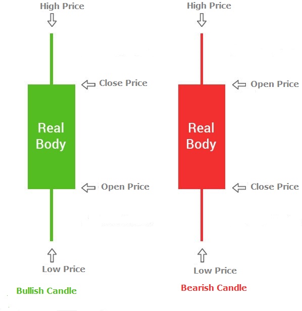
In candlestick charts, price movements for a time frame are represented in the shape of a candle. Similar to bar charts, a candle represents four data points: high, low, open and close. The open and close points are captured as the limits of a rectangle whereas the highs and lows are captured as lines from the rectangle.
To capture the trend of the stock, candles are uses colors and shading. In general, if the closing price of the stock is higher than the opening price, then the chart will be shaded with green color. If the closing price of the stock is lower than the opening price, then the chart will be shaded with red color. Red candle is also displayed as a dark body candle. Green candle is known as white or hollow body candle.
Candlestick charts are used widely among investors because its pictorially a better way of representing price movements for a specific period.
If a rising price chart is supported by rising volumes, it provides credible evidence of a bullish market. Similarly, if an increase in volume is accompanied by sharp fall in price, it indicates downtrend.